Cibo d’Argento
x USA RETAIL
Retail Roll-out • Brand Refresh • Website • Packaging • Print
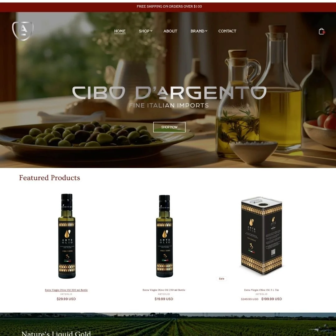
It all started with a name, Argento, an Italian family name that translates to “silver.” The goal was to create a brand identity that felt authentically Italian while standing apart from the sea of wannabe-Italian labels already on the shelf. We developed a visual system rooted in classic Italian colors, textures, and heritage, then elevated it with a fresh, modern edge that made the brand feel both timeless and contemporary.
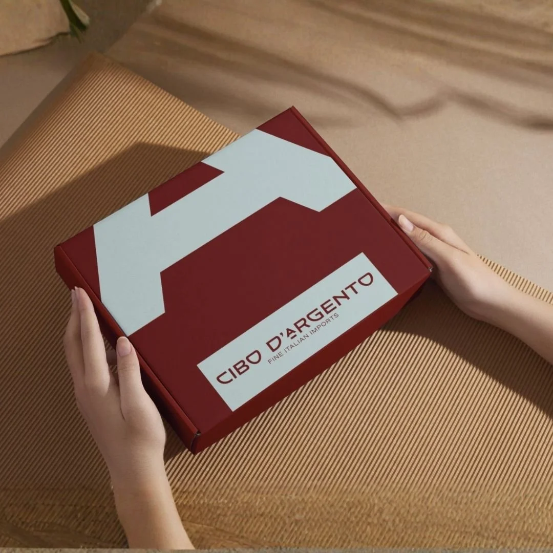
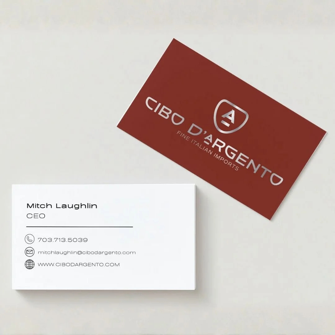
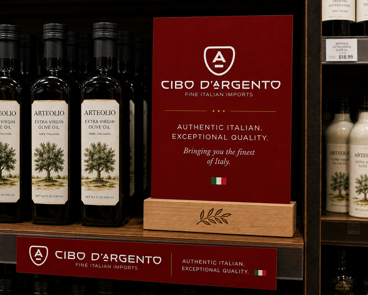
The build extended far beyond the logo. We led a complete website redesign and developed a full suite of branded materials, including custom packaging boxes, tissue paper, signage, display cards, and printed collateral. Every touchpoint was designed to create a cohesive and elevated customer experience, both online and in-store.
Once launched, the refreshed identity rolled out across all retail environments to ensure the brand looked and felt consistent everywhere it lived. From shelf displays to packaging details, the new creative brought a polished sense of Italian heritage to the retail experience while helping the brand make a stronger visual impact and stand out in a crowded marketplace.